Same bakery, two Instagram grids: only one looks like a brand
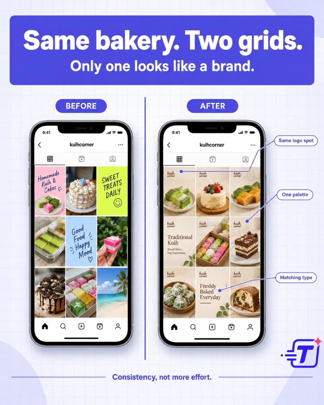
“Split-screen infographic for small businesses: a messy bakery Instagram grid beside a consistent one, showing that one brand kit beats guessing on every post.”
Be honest — which grid looks like yours? Same bakery, same kuih, two totally different first impressions. The messy one isn't lazy, it's just guessing every time — new font, new filter, new vibe with every post. The clean one runs on one locked colour palette, one logo placement, one photo style. That's not more effort, it's one decision made once. Consistency is what makes a small medium business look steady and trustworthy online. Tag a fellow bakery owner who needs to see this before their next post lah. 🍰
#SmallBusinessMalaysia #BrandKit #TapostTips
Generated from a one-line brief
More like this
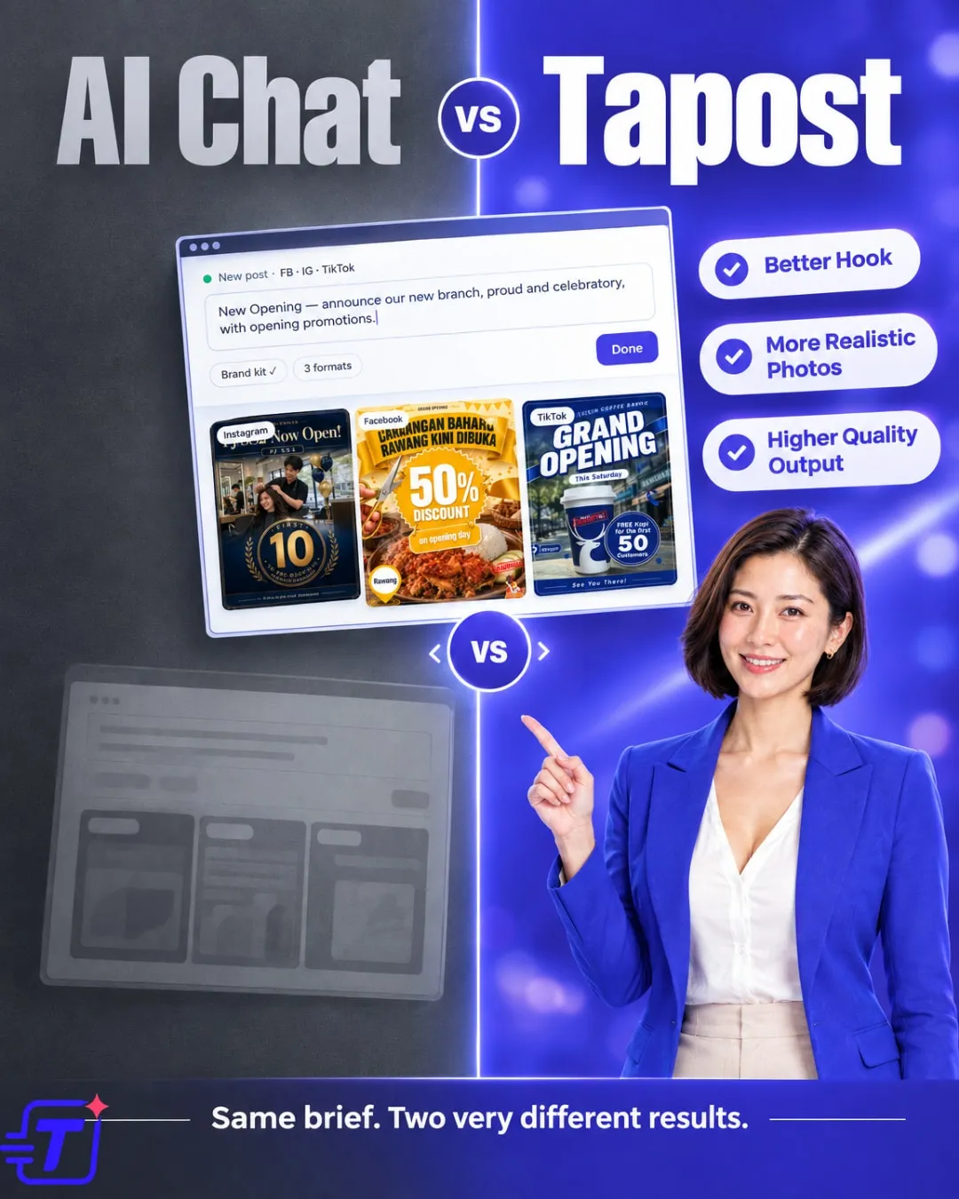
“6-slide comparison carousel: generic AI-chat images vs Tapost posts for food, beauty, fashion and gadgets, ending with a sign-up call to action.”
View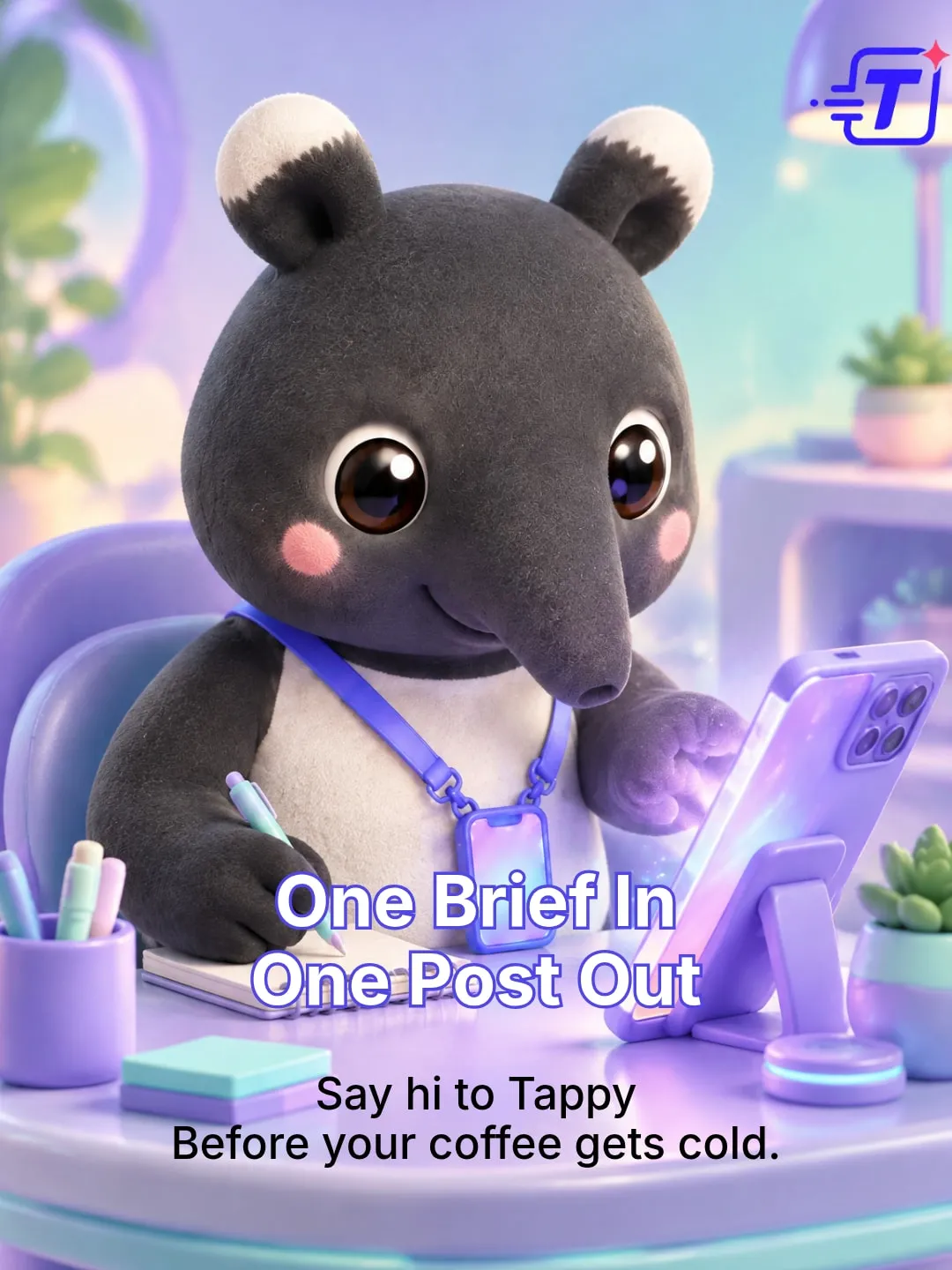
“3-slide 3D mascot carousel introducing Tappy the tapir, who jots a brief, conjures the posts and stamps approval before your coffee gets cold.”
View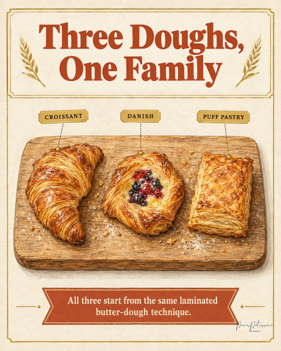
“4-slide infographic carousel teaching customers how the bakery's croissant, Danish and puff pastry differ, though all three start from the same laminated butter dough.”
View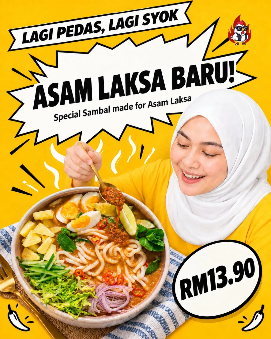
“Promo poster for Ayam Gepuk TipTop's new sambal made for Asam Laksa, "lagi pedas, lagi syok", at RM13.90, with the brand's character Siti tucking in.”
ViewWant posts like this for your brand?
Write one sentence. Tapost does the rest.